Colour is a powerful tool in the world of design, capable of evoking emotions, influencing perceptions, and communicating messages without words. In custom apparel design, the strategic use of colour can make the difference between a forgettable piece and one that leaves a lasting impression – if you work with an established supplier like R&P Prints.
Understanding the psychology of colour is crucial for creating apparel that resonates with your target audience and effectively represents your brand or message.
The Impact of Colour on Printed T-Shirt Design
The importance of colour psychology is particularly evident in printed t-shirt design. A well-chosen colour palette can attract attention, convey the right mood, and even influence purchasing decisions. Whether you’re creating merchandise for a brand, designing uniforms for a team, or crafting a personal statement piece, the colours you choose will play a significant role in how your apparel is perceived and received.
Understanding Common Colours and Their Psychological Associations
Let’s explore some common colours and their psychological associations:
- Red. Often associated with energy, passion, and excitement, red is an attention-grabbing colour. It can create a sense of urgency, making it popular for sale items or limited-edition merchandise. However, it should be used judiciously as it can also evoke feelings of aggression or danger.
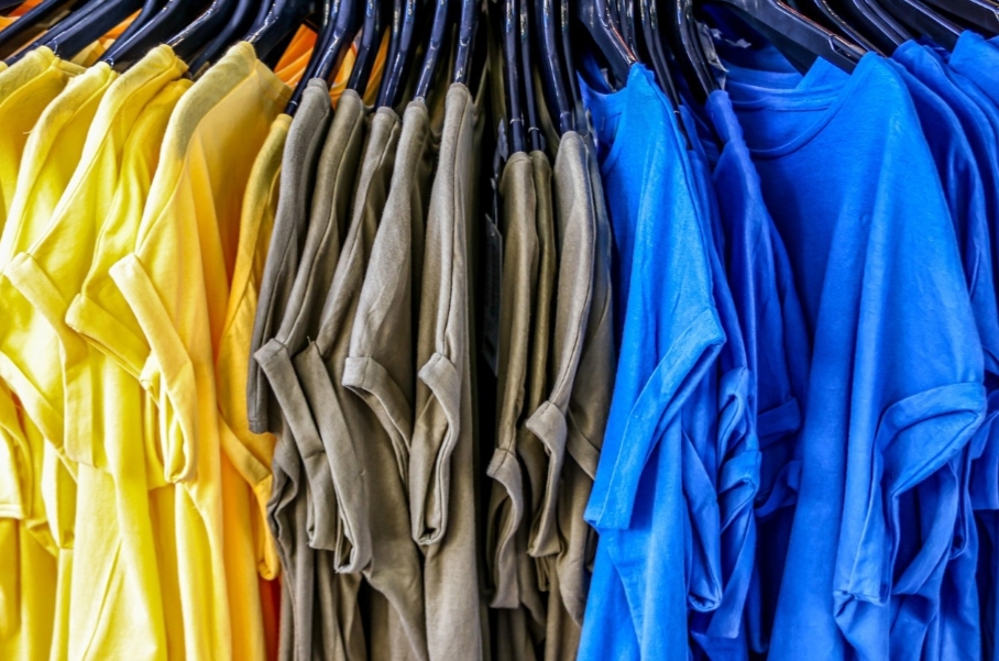
- Blue. Conveying trust, stability, and professionalism, blue is a popular choice for corporate apparel. It’s also associated with calmness and serenity, making it suitable for wellness or relaxation-themed designs.
- Green. Symbolizing nature, growth, and health, green is often used in eco-friendly or wellness-oriented apparel. It can also represent wealth and prosperity, making it a good choice for financial or success-themed designs.
- Yellow. Associated with happiness, optimism, and creativity, yellow can be an excellent choice for cheerful, uplifting designs. However, it can be visually overwhelming in large quantities and may not be suitable for more serious or professional contexts.
- Purple. Often linked to luxury, royalty, and creativity, purple can add a touch of elegance or mystique to your apparel design. It’s less commonly used than other colours, which can help your design stand out.
- Black. Versatile and classic, black conveys sophistication, power, and elegance. It’s a popular choice for high-end or minimalist designs, but can also be associated with negativity or mourning in some contexts.
- White. Representing purity, cleanliness, and simplicity, white is often used to create a sense of space in designs. It’s an excellent background colour but can be impractical for everyday wear due to its propensity to show stains.
- Orange. Combining the energy of red with the cheerfulness of yellow, orange is associated with enthusiasm and adventure. It’s often used in designs targeting younger audiences or for sports-related apparel.
- Pink. Traditionally associated with femininity, pink can also represent compassion, nurturing, and romance. Softer pinks are soothing, while brighter pinks are more energetic and youthful.
Colour Combinations: Creating Harmony and Contrast
When designing custom apparel, it’s important to consider not just individual colours but also colour combinations. Complementary colours (those opposite each other on the colour wheel) can create vibrant, eye-catching designs. Analogous colours (those next to each other on the colour wheel) can create harmonious, pleasing designs.
Cultural Considerations in Colour Choice
Cultural considerations are also crucial when choosing colours for your apparel design. Colours can have different meanings in different cultures. For example, while white represents purity and weddings in Western cultures, it’s associated with mourning in many Eastern cultures.
Context Matters: Matching Colours to Apparel Purpose
Additionally, consider the context in which your apparel will be worn. Bright, bold colours might be perfect for a summer music festival merchandise line, but may not be appropriate for corporate uniforms.
Practical Considerations: Fabric, Printing, and Lighting
Remember that colour perception can also be influenced by factors such as fabric texture, printing technique, and lighting conditions. Always test your designs on the actual fabric and under various lighting conditions before finalizing your choices.
In Conclusion
The psychology of colour is a powerful tool in custom apparel design. By understanding the emotional and cultural associations of different colours, you can create designs that not only look great but also effectively communicate your intended message and resonate with your target audience. Whether you’re designing for a brand, an event, or personal expression, thoughtful colour choices can elevate your apparel from mere clothing to a powerful form of visual communication.